Designing for Tablets: Why Your iPad App Shouldn’t Just Be a “Stretched” iPhone App
November 25, 2025 - 49 minutes readKey Takeaways:
- iPad design requires a fundamentally different approach: With iPad commanding over 55% of the global tablet market and generating nearly $27 billion in revenue for Apple in 2024, the platform demands purpose-built experiences. Apps implementing comprehensive modern iPad design patterns experience 31% higher user engagement and 23% longer session durations compared to stretched phone interfaces.
- UX matters more than ever: 88% of users won’t return to an app after a bad experience, and a well-designed UI can boost conversion rates by up to 400%. Stretched iPhone apps create frustrated users, poor reviews, and missed business opportunities in the competitive tablet space.
- iPadOS capabilities unlock business value: From multitasking features like Stage Manager and Split View to Apple Pencil integration and keyboard shortcuts, iPad-native design creates professional-grade experiences that differentiate your app from competitors and drive measurable ROI.
There’s a scene that plays out in meeting rooms and Slack channels at companies around the world: “We have an iPhone app. Can’t we just make it work on iPad?” The logic seems sound on the surface. Both devices run variants of iOS. The App Store serves both platforms. Why invest in a separate design when you could simply scale up what you already have?
The answer lies in understanding what users actually expect when they pick up an iPad versus an iPhone, and the very real business consequences of getting that expectation wrong. In a market where 88% of users won’t return to an app after a bad experience, and where roughly 49% of apps are uninstalled within the first month of download, cutting corners on tablet design isn’t just a missed opportunity. It’s a path to irrelevance.
Consider the numbers: the iPad held approximately 52.85% of the worldwide tablet market as of early 2025. According to Statista, Apple shipped nearly 57 million iPads globally throughout 2024, and during the first quarter of Apple’s 2025 financial year, iPad sales brought in a staggering $11.75 billion in revenue, a significant increase compared to the $7.02 billion earned in the same period of 2024. In the United States alone, the iPad was the most popular tablet in 2024, with over 40% of Americans owning one. This isn’t a niche market. It’s a massive platform with dedicated users who have specific expectations about how software should behave on their devices.
And those expectations aren’t being met by stretched iPhone apps. They’re being met by thoughtfully designed, purpose-built iPad experiences that leverage the platform’s unique capabilities: larger screen real estate, multitasking features, Apple Pencil integration, keyboard support, and the desktop-class behaviors that have transformed the iPad from a consumption device into a legitimate productivity platform.
In this comprehensive guide, we’ll explore why iPad design is fundamentally different from iPhone design, what happens when you treat the iPad as “just a big iPhone,” and how to create tablet experiences that users will actually love. Whether you’re a startup founder evaluating your mobile strategy or an enterprise product manager planning your next major release, understanding these principles will help you make better decisions and build better products.
The iPad Is Not a Big iPhone: Understanding the Fundamental Difference
When Apple first launched the iPad in 2010, the company faced an immediate challenge: there were no native iPad apps. The solution was to allow iPhone apps to run on the iPad, either at their original size (appearing as a small window in the center of the screen) or “stretched” to fill the display. It was a practical band-aid while the developer community caught up with iPad-native development.
Here’s the thing: that was fifteen years ago. And yet, the pattern persists. Too many apps still treat the iPad as an afterthought, offering scaled-up phone interfaces that waste screen space, ignore platform conventions, and frustrate users who invested in larger devices specifically for enhanced productivity and richer experiences.
Different Devices, Different Contexts
To understand why iPad design requires a different approach, start by considering how people actually use these devices. iPhones are mobile-first tools. People use them on the go, often with one hand, in quick bursts throughout the day. The compact screen demands efficiency: single-column layouts, prominent navigation bars, and interactions optimized for thumb reach.
iPads are different. Research shows that consumer usage patterns reveal over 78% of users prefer gesture-based UIs over traditional tap navigation on tablets. Users sit with their iPads at home, in coffee shops, at their desks. They prop them up on stands or connect them to keyboards. They use them for longer sessions, with both hands free, expecting experiences that justify the larger screen they chose to purchase.
The physical differences translate into interaction differences. iPhone design optimizes for the “thumb zone,” that comfortable arc a user can reach while holding their phone in one hand. iPad design, by contrast, can take advantage of the entire display. Touch targets can be smaller because users have more precision when holding a tablet with both hands or using it on a surface. Content can be denser because users sit farther from the screen and have more visual real estate to scan.
The Information Architecture Gap
Perhaps the most significant difference between iPhone and iPad design lies in information architecture. As Apple’s Human Interface Guidelines make clear, these differences necessitate platform-specific design approaches. Information Architecture Approaches differ fundamentally between the platforms:
- iPad optimizes for multi-column layouts, persistent sidebar navigation, detailed inspector panels, and simultaneous information display. The iPad enables persistent context maintenance across complex interactions.
- iPhone maintains single-column flows, bottom navigation patterns, modal presentations, and sequential task completion models. iPhone focuses on clear entry/exit points with streamlined task flows.
This isn’t just a recommendation. It’s a reflection of how users actually think and work on different screen sizes. On an iPhone, users drill down through hierarchies: tap to see a list, tap an item to see details, tap back to return. On an iPad, users expect to see the list and the details simultaneously, maintaining context while navigating.
Consider an email app. On iPhone, you see your inbox, tap a message, read it in full-screen, then navigate back. On iPad, you see your folders on the left, your message list in the middle, and the selected message’s content on the right. You can triage emails, reply to messages, and organize your inbox without losing sight of the bigger picture. This isn’t a luxury feature. It’s what iPad users expect as standard.
The High Cost of “Good Enough”: What Happens When You Stretch Instead of Design
The consequences of lazy iPad design extend far beyond aesthetics. When you deploy a stretched iPhone app to the iPad, you’re making a deliberate choice to deliver a substandard experience to a significant portion of your potential user base. Let’s examine what that actually costs you.
Wasted Screen Real Estate
A stretched iPhone app on a 12.9-inch iPad Pro displays content designed for a 6.7-inch screen on a canvas nearly twice as large. The result is massive amounts of wasted space: oversized buttons that look cartoonish, typography that appears blown up rather than refined, and single-column layouts that leave acres of empty display.
This isn’t just ugly. It’s functionally inferior. Users who purchased a larger device to see more content simultaneously are instead seeing less density than they would on a well-designed phone app. They’re scrolling more, tapping more, and accomplishing less. In an era where 43% of users will abandon an app after waiting just three seconds for it to load, wasting their time with inefficient layouts is a recipe for churn.
Ignored Platform Conventions
iPad users develop muscle memory and expectations based on native iPadOS apps. They expect sidebars that persist across navigation. They expect Split View and Slide Over support. They expect keyboard shortcuts to work. They expect to use Stage Manager to run multiple apps simultaneously.
A stretched iPhone app ignores all of this. It runs in a single fixed size, can’t participate in multitasking, doesn’t respond to keyboard input beyond basic typing, and feels like a foreign visitor on the platform. Every time users have to adapt their expectations to accommodate your app’s limitations, you erode their goodwill. Research tells us that 48% of customers feel that poor mobile designs imply the company doesn’t care about their business. On iPad, where users have made a larger investment in their device, that perception is even more damaging.
Poor Reviews and Diminished Discoverability
App Store users are vocal about their disappointments. Browse the reviews of any stretched iPhone app on iPad, and you’ll find a chorus of complaints: “Doesn’t use the full screen,” “Looks terrible on my iPad,” “Please update for iPad support.” These negative reviews drag down your overall rating, which directly impacts discoverability and download rates.
Apple’s App Store algorithms favor apps that deliver great experiences on the devices where they’re being evaluated. An app that shows as “iPhone only” or receives consistently poor iPad reviews will struggle to surface in search results on iPads, even if the iPhone version is well-regarded. You’re effectively ceding the tablet market to competitors who invested in proper iPad design.
Missed Business Opportunities
 Here’s a statistic that should grab the attention of any business leader: a well-designed user interface can increase a website’s conversion rate by up to 200%, and a better UX design can achieve conversion rates of up to 400%. The same principles apply to mobile apps. When you frustrate iPad users with stretched phone interfaces, you’re leaving money on the table.
iPad users tend to be engaged, affluent consumers willing to pay for premium experiences. They’re more likely to complete purchases on larger screens, more likely to engage with content-rich apps, and more likely to develop loyalty to apps that respect their platform choice. When you fail to design for them, you don’t just lose their downloads. You lose their lifetime value.
The Building Blocks of Exceptional iPad Design
Creating a truly great iPad app isn’t just about making things bigger. It’s about rethinking your interface from the ground up to leverage the platform’s unique strengths. Let’s examine the key design elements that separate excellent iPad apps from their stretched-phone counterparts.
Multi-Column Layouts and Split Views
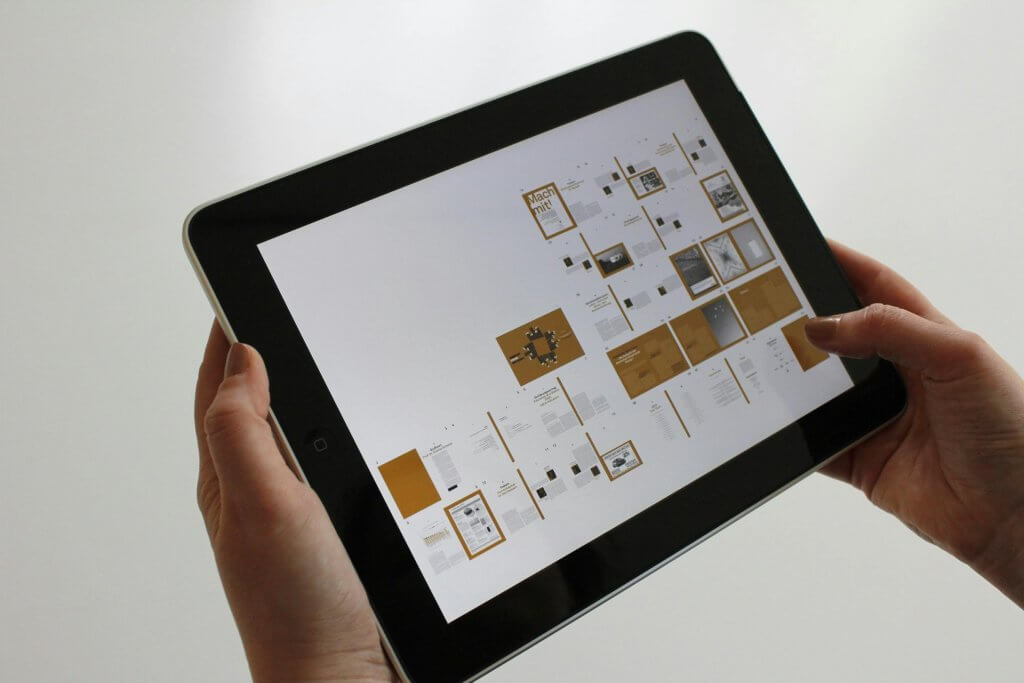
The most immediately visible difference in a well-designed iPad app is its use of multiple columns to display information hierarchically. Where an iPhone app presents content sequentially (list → detail → sub-detail), an iPad app can present it simultaneously (list and detail and sub-detail).
This pattern, sometimes called the “master-detail” layout, is foundational to iPad design. Think of Mail, Notes, Files, or any professional productivity app on iPad. The left column provides navigation and context. The main content area displays the selected item. An optional right-hand inspector shows detailed properties or actions.
The benefits extend beyond aesthetics. Multi-column layouts reduce cognitive load by maintaining context. Users don’t have to remember where they came from or rebuild mental models after each navigation. They can make comparisons more easily, work more efficiently, and accomplish more in less time. As UX experts note, rarely will stretching a handset screen to tablet size or squashing a desktop down work very well. You need to take advantage of a device’s scale: put more information on the screen, use columns for rapid switching, or design entirely new interfaces that use all of the gesture-driven space available.
Adaptive Layouts That Actually Adapt
Modern iPads come in multiple sizes, from the compact iPad mini to the expansive 12.9-inch iPad Pro. They can be used in portrait or landscape orientation. They can run apps in full-screen, Split View, or Slide Over modes. And with external display support, they can even drive second screens.
Great iPad apps handle all of these scenarios gracefully through adaptive layout systems. Rather than designing for one fixed screen size, you design for a range of size classes and let the system adjust your interface appropriately. A three-column layout in landscape might become two columns in portrait, with the third column accessible via a button or gesture. The same app running in a narrow Split View might collapse to a single column, similar to its iPhone counterpart.
Apple’s frameworks make this achievable through features like SwiftUI’s adaptive containers and UIKit’s trait collections. The key is designing with flexibility in mind from the start, rather than treating responsive behavior as an afterthought. As mobile design experts note, 83% of users expect websites and apps to work seamlessly across all their devices. On iPad, “seamlessly” means adapting to whatever configuration the user prefers.
Typography and Visual Density
The larger canvas of an iPad allows for more sophisticated typography. Rather than simply scaling up iPhone font sizes (which often looks wrong), iPad apps should use typography that’s optimized for the viewing distance and context of tablet use.
This typically means slightly larger body text for comfortable reading at arm’s length, but not proportionally larger. It means headlines and titles that provide visual hierarchy without overwhelming the screen. It means appropriate line lengths that optimize readability, generally between 45-75 characters per line. And it means using Dynamic Type to respect users’ accessibility preferences while maintaining beautiful layouts.
Visual density follows similar principles. iPad interfaces can be denser than iPhone interfaces because users have more screen to scan and typically aren’t in “glance and go” mode. Buttons can be smaller. Margins can be tighter. Lists can show more information per row. The goal is to make efficient use of the larger canvas without creating overwhelming visual noise.
Touch Target Optimization
Apple’s Human Interface Guidelines recommend minimum touch target sizes of 44×44 points, but this guidance applies differently on iPad than iPhone. On iPhone, larger touch targets compensate for the imprecision of one-handed thumb use. On iPad, where users typically interact with both hands and often from a more stable position, touch targets can be closer to those minimums without sacrificing usability.
Additionally, iPad apps should consider the pointer experience. With the addition of trackpad and mouse support in iPadOS, many users navigate with precision cursors rather than fingers. Great iPad apps provide hover states, cursor adaptation, and click behaviors that feel natural with pointing devices while remaining fully functional for touch.
Mastering iPadOS-Specific Features
Beyond layout considerations, truly exceptional iPad apps embrace the platform-specific features that distinguish iPadOS from iOS. These features transform the iPad from a content consumption device into a productivity powerhouse, and users notice when apps support them versus when they don’t.
Multitasking: Split View, Slide Over, and Stage Manager
iPadOS multitasking has evolved dramatically since Apple first introduced Split View in 2015. Today, iPad users expect sophisticated multitasking capabilities:
- Split View lets users run two apps side-by-side, with adjustable widths. Your app should look great at full width, half width, and the narrower one-third width.
- Slide Over presents a compact floating window that users can summon from the side. This is effectively a phone-sized view that should display your iPhone layout, if you have one, rather than a cramped tablet layout.
- Stage Manager (on M-series iPads) enables Mac-like windowed multitasking with resizable, overlapping windows and external display support. Stage Manager supports up to four apps on the iPad and four on the external screen, allowing power users to manage multiple projects simultaneously.
The latest iPadOS has dramatically enhanced multitasking, making the iPad more like a Mac than ever before. As one technology reviewer noted, recent iPadOS releases represent the most significant change to the iPad software we’ve ever seen. Between new multitasking windows, Slide Over refinements, and the return of Split View with enhanced capabilities, multitasking on the iPad finally feels natural, intuitive, and productive without compromise.
Apps that don’t support multitasking feel broken on modern iPads. They can’t be used alongside other apps, which forces users to choose between your app and their workflow. In contrast, apps that embrace multitasking become integral parts of how people work, staying on screen throughout the day rather than being opened, used, and dismissed.
Apple Pencil Integration
Apple Pencil has transformed the iPad into a platform for creativity, note-taking, and precision input. According to Apple, Apple Pencil is great for drawing, sketching, coloring, taking notes, marking up emails, and more with pixel-perfect precision and industry-leading low latency. Apps can take advantage of its intuitive touch surface, which supports double-tap and squeeze gestures, haptics, and barrel-roll angle tracking.
For many categories of apps, Apple Pencil support isn’t optional. It’s expected:
- Note-taking and annotation apps should support handwriting input, often via Apple’s PencilKit framework which provides a complete drawing experience with minimal development effort.
- Creative apps should leverage pressure sensitivity, tilt detection, and the new squeeze gestures of Apple Pencil Pro for professional-grade tools.
- Productivity apps should support signature capture, document markup, and Scribble (converting handwriting to typed text in any text field).
- Design tools can use hover detection on newer Apple Pencils to preview brush strokes before committing, dramatically speeding up creative workflows.
Even apps that aren’t obviously “pencil apps” benefit from thoughtful stylus support. Precision selection in spreadsheets. Quick annotations in document review apps. Navigation gestures that work equally well with finger or stylus. Users who own Apple Pencil use it constantly, and they appreciate apps that recognize and support that usage pattern.
Keyboard and Trackpad Support
With Apple’s Magic Keyboard and third-party keyboard accessories, many iPad users interact with their tablets via hardware keyboards and trackpads. This fundamentally changes how they expect apps to behave.
 Keyboard support goes beyond simple text input. Users expect keyboard shortcuts for common actions: Command+N to create new items, Command+F to find, Command+Z to undo. They expect Tab to move between fields and Return to confirm actions. According to Apple’s developer guidance, keyboard shortcuts offer quick commands for managing and closing apps, and expanded keyboard shortcuts offer quick commands for users with external keyboards attached.
Trackpad support requires implementing pointer interactions: hover states that preview actions, right-click context menus, scroll behaviors that feel natural with a precision pointing device. Apple describes how dynamic pointer effects and behaviors enhance the experience of using a pointing device with iPad, automatically adapting to the current context, providing rich visual feedback and just the right level of precision needed to enhance productivity.
When these features work well, iPad apps feel like desktop-class software running on a tablet. When they’re absent, users are constantly reminded that they’re using a “mobile app” rather than a proper tablet application.
Drag and Drop
Drag and drop is a fundamental interaction pattern on iPad that barely exists on iPhone. Users can drag content between apps in Split View, from the Files app or Photos into your app, or within your app to reorganize content. Apple emphasizes that apps can let users move text, images, and files from one app to another with multitouch APIs, supporting drag and drop to let them quickly move content in a way that feels natural.
Apps that support drag and drop become part of the iPad ecosystem. Users can drag an image from Safari into your document editor. They can drag a contact from your CRM into their email compose window. They can rearrange items in your app by simply picking them up and moving them. Apps that don’t support drag and drop feel isolated, forcing users through copy-paste workflows that feel archaic on a platform designed for fluid content movement.
Navigation Patterns That Work on Tablets
Navigation is where stretched iPhone apps most obviously fail on iPad. Phone navigation patterns, optimized for single-handed use on small screens, simply don’t translate to larger tablets. Here’s how to approach navigation correctly.
From Tab Bars to Sidebars
The bottom tab bar is a signature iPhone navigation pattern. It keeps primary actions within thumb reach and provides constant visibility of your app’s main sections. But on iPad, a bottom tab bar looks awkward. It wastes the bottom edge of a large screen on navigation that could be more efficiently placed elsewhere.
iPad-optimized apps typically replace or supplement tab bars with sidebars. The sidebar pattern puts navigation in a persistent left column that can expand or collapse based on available space. This matches how users naturally scan interfaces (left-to-right in Western languages), groups navigation with content hierarchy, and scales gracefully across device sizes.
Apple’s own apps demonstrate this pattern consistently. On iPhone, Mail uses a tab bar. On iPad, it uses a sidebar with multiple levels of hierarchy. On iPhone, Notes shows a simple list. On iPad, Notes presents folders in a sidebar, notes in a list, and content in a detail view. The same information is organized differently to match the platform’s conventions and capabilities.
Contextual Toolbars
iPad apps have more room for toolbars, and they should use them wisely. Rather than hiding actions behind hamburger menus or ellipsis buttons (patterns necessitated by iPhone’s limited space), iPad apps can surface common actions in visible, contextual toolbars.
The key is context-awareness. A text editing view might show formatting tools when text is selected. A photo viewing screen might show sharing and editing options in a readily accessible toolbar. A list view might surface sorting and filtering controls. These tools appear when relevant and disappear when they’re not, keeping the interface clean while making actions discoverable.
Recent iPadOS versions introduced a redesigned tab bar that floats above app content and complements the sidebar, helping users stay focused on what matters most while keeping favorite tabs within reach. The new floating tab bar elegantly morphs into the sidebar so users can dive deeper into an app’s full functionality. This kind of adaptive, contextual navigation is what separates good iPad apps from great ones.
Popovers and Modal Presentations
On iPhone, modal presentations typically fill the screen or slide up from the bottom. On iPad, you have more options. Popovers can appear anchored to a button or selection, presenting options or forms without covering the entire display. Sheets can be presented at various sizes, from compact forms to larger configuration views.
These presentation styles maintain context in ways that full-screen modals cannot. A user configuring settings in a popover can still see the content those settings will affect. A user composing a quick reply can see the message they’re responding to. This contextual awareness speeds up workflows and reduces cognitive load.
The Business Case for Native iPad Design
Investing in proper iPad design requires resources: design time, development effort, and ongoing maintenance. Is it worth it? The data suggests strongly that it is.
The ROI of Good UX
User experience research consistently demonstrates that UX investment pays dividends. Every dollar companies invest in UX results in a return of $100 (a 9,900% ROI). Design-centered companies have outperformed the S&P by 228% over a ten-year period. These numbers aren’t iPad-specific, but they establish the principle: good design is good business.
On iPad specifically, the returns can be even more pronounced. Tablet users typically engage in longer sessions, complete more transactions, and demonstrate higher lifetime value than phone-only users. By delivering an experience that meets their expectations, you capture more of that value.
Competitive Differentiation
In crowded app categories, iPad optimization can be a genuine differentiator. When competing apps offer stretched phone interfaces, your native iPad experience stands out. Users searching for solutions on their iPads will notice which apps are actually designed for their device.
This differentiation extends to marketing and positioning. “Designed for iPad” isn’t just a badge in the App Store. It’s a statement about your commitment to quality and user experience. For B2B apps especially, where enterprises may be deploying iPads at scale, native tablet support can be a deciding factor in procurement decisions.
User Retention and Reviews
The relationship between UX quality and retention is well-documented. On average, companies that put in the work to improve customer experience see a 42% improvement in customer retention, a 33% improvement in customer satisfaction, and a 32% increase in cross-selling and up-selling. These improvements come from meeting user expectations, and on iPad, those expectations include native tablet design.
App Store reviews reflect this reality. Apps with thoughtful iPad designs receive praise in reviews, building ratings that attract new users. Apps that neglect iPad users receive criticism that drags down their averages. Given that 94% of users say they don’t trust a poorly designed or outdated website/app, those ratings matter significantly for discovery and conversion.
Enterprise and Education Markets
iPads are particularly prevalent in enterprise and education contexts. Schools deploy iPads for digital learning. Healthcare providers use them for patient care. Retailers use them for point-of-sale. Field workers use them for inspections and data collection. In these environments, app quality directly impacts operational efficiency.
Globally, over 93,000 companies rely on iPads, with 56% of them located in the United States. Enterprise customers expect professional-grade software that maximizes the hardware investment they’ve made. A stretched iPhone app in an enterprise deployment isn’t just a poor user experience. It’s a productivity drag that IT decision-makers will notice and remember when renewal time comes.
Implementation: Practical Steps for iPad-Native Design
Understanding why iPad design matters is one thing. Actually implementing it is another. Here’s a practical roadmap for taking your app from stretched-phone to native-tablet.
Step 1: Audit Your Current Experience
Start by honestly assessing your current iPad situation. Run your app on various iPad sizes (mini, standard, Air, Pro) in both orientations. Test it in Split View at multiple widths. Try using it with a keyboard and trackpad. Document every awkward moment, every wasted pixel, every interaction that feels wrong.
Pay particular attention to your competitors. How do they handle iPad? Are there iPad-native apps in your category that set user expectations? Where are the opportunities to differentiate through better design?
Step 2: Identify Your Core Flows
You don’t need to redesign everything at once. Identify the core flows that users perform most frequently or that drive the most business value. These are your priorities for iPad optimization. A retail app might focus on browsing and checkout. A productivity app might focus on content creation and organization. A communication app might focus on messaging and collaboration.
Map these flows and reimagine them for iPad’s capabilities. How could multi-column layouts improve them? Where could users benefit from seeing more context simultaneously? What iPad-specific features (Apple Pencil, keyboard shortcuts, drag and drop) could enhance these flows?
Step 3: Design for Size Classes
Apple’s size class system provides a foundation for adaptive design. Rather than designing for specific device sizes, design for compact and regular horizontal and vertical size classes. This abstraction ensures your layouts adapt appropriately whether running on an iPad mini in portrait, a 12.9-inch iPad Pro in landscape, or in Split View at any width.
Consider these common configurations and ensure your app handles them gracefully: full-screen portrait (regular/regular), full-screen landscape (regular/regular), Split View 50% (compact/regular or regular/regular depending on device), Split View 33% (compact/regular), Slide Over (compact/regular).
Step 4: Implement Platform Features Progressively
You don’t need to support every iPadOS feature at launch. Prioritize based on your user needs:
- Essential: Multi-column layouts, multitasking support (Split View/Slide Over), adaptive navigation
- Important: Keyboard shortcuts for common actions, trackpad/mouse support, drag and drop for content movement
- Enhanced (category-dependent): Apple Pencil integration, external display support, Stage Manager optimization
Each feature you add improves the experience incrementally. Launch with the essentials, then layer in enhancements based on user feedback and business priorities.
Step 5: Test with Real iPad Users
Testing on simulators and your own devices isn’t enough. Get your designs in front of actual iPad users, preferably those who use tablets as their primary computing devices. Watch how they expect to navigate. Note where they try to use gestures or shortcuts that your app doesn’t support. Listen to their feedback about what feels native and what feels foreign.
This testing should include multiple configurations: keyboard users and touch-only users, Apple Pencil owners and those without, power users who multitask constantly and casual users who run apps full-screen. Each segment will reveal different aspects of your iPad experience.
Common Mistakes to Avoid
As you develop your iPad strategy, watch out for these common pitfalls:
Simply Scaling Up iPhone Designs
Bigger buttons, bigger text, bigger images. It seems logical, but it results in apps that look childish and waste space. Design specifically for iPad’s capabilities rather than magnifying what exists.
Ignoring Landscape Orientation
Many iPad users prefer landscape orientation, especially with keyboard accessories. Apps that only work in portrait or that awkwardly stretch portrait layouts to landscape frustrate these users constantly.
Neglecting Multitasking
An app that can’t run in Split View forces users to choose between your app and their workflow. In the productivity context where iPads excel, this is often a dealbreaker.
Hiding Essential Features
On iPhone, space constraints necessitate hiding features behind menus. On iPad, you have room to surface commonly-used features. Don’t hide things out of habit when you have the space to show them.
Forgetting About External Input
Many iPad users attach keyboards and use trackpads or mice. Apps without keyboard shortcuts or pointer support feel incomplete to these users.
Looking Ahead: The Future of iPad Design
The iPad continues to evolve, and so do user expectations. Apple’s ongoing investment in iPadOS, culminating in the desktop-class features of recent releases, signals that the platform will only become more capable and more demanding of quality software.
According to Apple Developer Relations from WWDC 2024, applications implementing comprehensive modern iPad design patterns experienced 31% higher user engagement, 23% longer session durations, and 18% better App Store ratings compared to traditional mobile-first approaches. The transformation of iPad design represents a fundamental paradigm shift that transcends traditional mobile interface conventions, establishing the iPad as a legitimate professional computing platform with unique design requirements and unprecedented capabilities.
Stage Manager, external display support, and evolving Apple Pencil capabilities suggest a future where iPads increasingly compete with laptops for productivity tasks. Apps that embrace this direction, treating iPad as a professional computing platform rather than a big phone, will be positioned to capture the most engaged and valuable users.
The question isn’t whether to invest in proper iPad design. It’s whether you can afford not to. In a market where user experience directly drives business outcomes, where reviews and ratings determine discoverability, and where users have abundant alternatives, delivering a stretched phone app to tablet users is simply leaving opportunity on the table.
Conclusion
Your iPad app shouldn’t be a stretched iPhone app because iPad users aren’t using big iPhones. They’re using tablets, devices they chose specifically for their larger screens, enhanced productivity features, and richer interaction models. When you deliver an iPhone app on an iPad, you’re essentially telling those users that you don’t understand their needs or don’t care enough to meet them.
The good news is that the investment in proper iPad design pays dividends. Better user experiences lead to better retention, better reviews, and better business outcomes. The tools and frameworks to build great iPad apps exist and are well-documented. The design patterns are established and proven.
What’s needed is commitment: commitment to understanding your iPad users, commitment to designing specifically for their platform, and commitment to treating tablet design as a first-class concern rather than an afterthought.
At Dogtown Media, we’ve helped countless clients transform their mobile presence with thoughtful, platform-specific design. We understand that iPad development isn’t just about making iPhone apps bigger; it’s about creating experiences that leverage everything the platform has to offer. From multi-column layouts and multitasking support to Apple Pencil integration and keyboard shortcuts, we build iPad apps that users actually want to use.
If you’re ready to give your iPad users the experience they deserve, we’d love to talk. Your users are waiting for an app that respects their platform choice. Let’s build it together.
Frequently Asked Questions
Q: Can I use the same codebase for iPhone and iPad, or do I need separate apps?
A: You can absolutely use the same codebase for both platforms, and Apple’s frameworks are designed to support this. The key is using adaptive design techniques rather than fixed layouts. SwiftUI and UIKit both support size classes, trait collections, and responsive layouts that automatically adjust to different screen sizes. Your business logic, data models, and much of your view code can be shared. What changes is how that content is arranged, not the content itself. A well-architected app separates presentation from logic, allowing you to provide different layouts for different size classes while maintaining a single codebase. This approach is actually more efficient than maintaining separate iPhone and iPad apps because bug fixes and feature additions automatically propagate to both platforms.
Q: How much additional development time should I budget for proper iPad support?
A: The answer varies significantly based on your app’s complexity and your current architecture. If you’re building from scratch with adaptive design in mind, adding iPad support might only add 10-20% to your development time, primarily for designing and testing tablet-specific layouts. If you’re retrofitting an existing iPhone app that wasn’t built with adaptability in mind, the effort could be substantially more, potentially 30-50% additional work to properly refactor layouts and navigation patterns. The good news is that this investment pays ongoing dividends. Once you have proper adaptive architecture in place, maintaining both platforms becomes much easier than maintaining separate apps. The initial investment in good architecture saves significant time over the life of the project.
Q: What if my app is simple and doesn’t really need multiple columns?
A: Even simple apps benefit from iPad-native design. While you may not need a complex multi-column layout, you should still optimize typography for larger screens, support multitasking so users can run your app alongside others, implement appropriate touch targets and visual density, and add keyboard shortcuts for common actions. A single-column design can still be iPad-native if it uses the space thoughtfully. Consider wider margins for comfortable reading, appropriately sized controls, and centered or constrained-width content that doesn’t stretch edge-to-edge. The goal isn’t complexity; it’s appropriateness for the platform. A simple, elegant iPad design is far better than a stretched iPhone design that wastes space.
Q: Should I support all iPad models, or can I focus on newer devices?
A: Apple’s adaptive design systems make it relatively easy to support all iPad models, and you should generally try to do so. However, you can take advantage of newer capabilities (like Stage Manager on M-series iPads) progressively while ensuring older devices still get a quality experience. Check Apple’s usage data for your target market. Research shows that the iPad 9th generation WiFi had the highest market share at 28.40% as of late 2025, followed by older models. Excluding older iPads means excluding a significant portion of your potential user base. The recommended approach is to design for the smallest iPad size class first (iPad mini in Split View is particularly constrained), ensure that baseline works well, then enhance the experience on larger screens and newer hardware.
Q: How important is Apple Pencil support, really?
A: It depends entirely on your app category. For creative apps, note-taking apps, document annotation apps, or anything involving drawing or handwriting, Apple Pencil support is essential. Users with Apple Pencil expect to use it, and they’ll be frustrated by apps that don’t support it. For other categories, Apple Pencil support might be nice-to-have rather than must-have. However, even apps that don’t obviously need pencil input can benefit from supporting Scribble (handwriting-to-text in text fields) and basic pencil navigation. At minimum, ensure your app doesn’t behave strangely when users interact with Apple Pencil. The tool should work as a precise pointer even if you don’t implement specialized features.
Q: What’s the best way to test iPad designs if I don’t have multiple iPad models?
A: Xcode’s simulator is your first line of defense. You can simulate any iPad model in any orientation and test Split View, Slide Over, and other multitasking modes. However, simulators don’t capture everything, particularly performance characteristics, touch interaction feel, and hardware feature integration. For production apps, consider using device farms like AWS Device Farm or BrowserStack that provide access to real hardware for testing. You can also invest in a representative range of devices: one iPad mini (compact form factor), one standard iPad or iPad Air (mid-range), and optionally an iPad Pro (largest screen, newest features). Testing on at least three physical devices catches most issues that simulators miss.
Tags: app design, Apple Pencil, ipad app development, iPadOS, mobile app UX, multitasking, Stage Manager, tablet design, user experience


