The Apple Watch has been on the market long enough now that it’s begun to lose the new gadget glow. This is good for iOS and Apple Watch developers. Soon it will have completed the transition from “toy” to “tool,” offering developers much more long-term value in building relationships with users. Early apps for the platform have suffered somewhat from the “toy” feeling of the tiny new device, as iPhone app development companies rushed to transfer their UX from the pocket to the wrist, often with little thought about how the smartwatch experience is fundamentally different from traditional mobile.
Here are a few trends we’d like to see developed further by Apple and the development community, and a few tips for how to craft Apple Watch apps that offer real value to users.
Creating distinct notifications
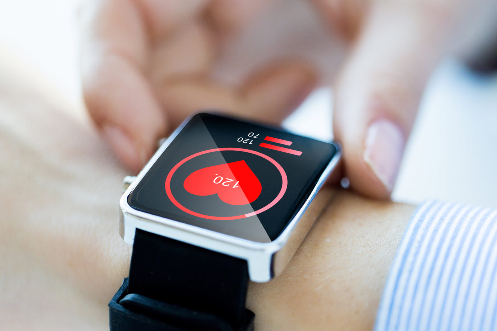
One of the most exciting promises of the Apple Watch is the possibility that it could differentiate between notifications. The inability to distinguish a critical notification (weather alert, message from loved one) from a non-critical notification (Instagram like, Facebook thread comment) is a huge problem in mobile right now — particularly as user attention moves away from native UIs to a more holistic “notification timeline.” The Apple Watch’s ability to create distinct buzzes, taps, rolls, and throbs has single-handedly turned the vibrate function into its own lexicon. The question is, how long will it take for San Francisco mobile app developers to take full advantage of that lexicon?
Elevating the micro-interaction
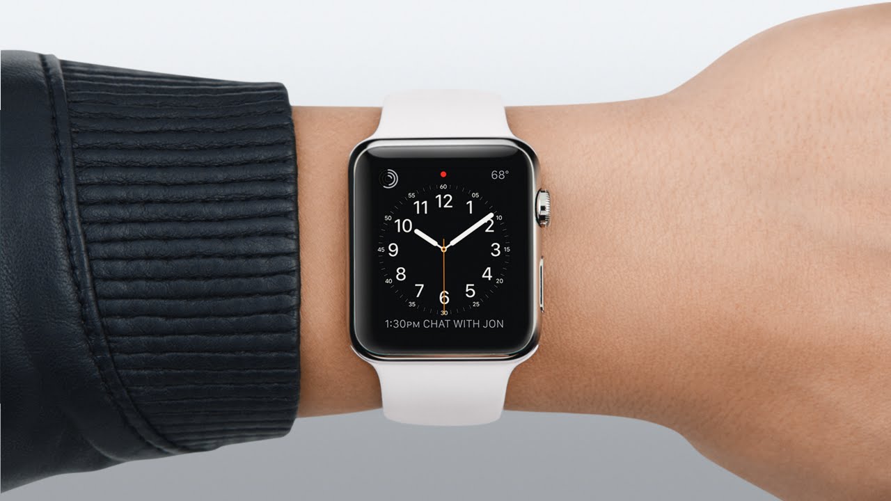
If you’ve owned an Apple Watch, you know that using the screen for more than a few seconds is surprisingly tiring. It’s an odd position for the arm, and if you’re in a place where you can rest it on a surface, chances are an iPhone makes more sense. This may prove to be a positive constraint for Apple Watch developers moving forward, since it limits the UX considerations to a micro-interaction. Like Twitter’s 140 character limit, it’s sure to drive a lot of creativity among UX designers.
Embracing augmented reality
Creative directer Peter Lewis described the difference between the iPhone and the Apple Watch perfectly in this post to Medium as a question of alternate reality vs. augmented reality. Many early blunders in Apple Watch design were directly caused by a failure to understand this subtle difference. Users go to mobile apps to escape, or to immerse themselves in data.
Smart watches, meanwhile, are more like Google Glass — a way to enhance and add on to reality without taking 100% of attention away from it.