In this article you’ll learn about:
- Prioritize Security and Privacy Through Design: Given the sensitive nature of health information, it’s essential for healthcare apps to prioritize security and privacy. This can be achieved by incorporating clear and concise privacy policies, trust badges and certifications, and secure login and authentication methods. These elements should be communicated effectively through the app’s design to foster user confidence.
- Collaborate with Experienced Graphic Designers: Graphic designers play a vital role in healthcare app branding. They bring a wealth of knowledge and expertise to healthcare app branding projects, understanding the unique challenges and requirements of designing for the healthcare industry. Collaboration between app developers and graphic designers is critical for successful healthcare app branding.
- Establish a Consistent Visual Brand Identity and Enhance User Experience: A consistent visual brand identity is essential for healthcare app branding, as it helps users recognize and trust the app. This consistency extends beyond the app’s logo and includes the overall look and feel, typography, color palette, and imagery used throughout the app. Additionally, the user experience (UX) goes beyond the functional utility of the app. It extends to how the users feel about their interaction with the app. An essential aspect of creating a positive UX is the visual design of the app, which includes its layout, color schemes, typography, and the use of images or icons.
Why Visual Design Matters for Healthcare App Branding
Visual design is more than just the aesthetic appeal of a healthcare application; it is a fundamental part of the branding process that directly influences user perception, engagement, and loyalty. In an increasingly digital era where countless healthcare apps are vying for consumer attention, the visual design can significantly set a brand apart from the competition.
Visual design is not an afterthought in healthcare app branding; it is a strategic tool that can drive user engagement, brand recognition, and trust. By investing in quality visual design, healthcare app brands can not only enhance the user experience but also reinforce their brand identity, values, and positioning. As the digital healthcare landscape becomes more competitive, prioritizing visual design in branding is no longer a luxury but a necessity.
At Dogtown Media, we are not just creators; we are passionate innovators dedicated to reshaping the future of healthcare with smart, intuitive, and visually compelling mobile apps. With a legacy marked by the successful development of numerous healthcare apps, we appreciate that the healthcare sector is a realm where aesthetics are much more than just a superficial layer.
From the importance of color schemes, typography, and iconography to crafting the overall user experience, we delve into why visual design is a pivotal element in distinguishing your healthcare app in a crowded market. Let’s explore the artistry of visual design and its transformative role in healthcare app branding.
How visual design impacts user engagement and adoption
 Visual design plays a crucial role in the success of a healthcare app by influencing user engagement and adoption. An aesthetically pleasing and well-structured interface attracts users and keeps them engaged, while a poor design can lead to confusion and abandonment. Effective visual design elements such as clear navigation, intuitive layouts, and meaningful icons contribute to a positive user experience, encouraging users to explore and utilize the app’s features. Here’s why visual design is of paramount importance for healthcare app branding.
User Attraction and Retention
As the adage goes, “first impressions last.” The initial interaction that a user has with a healthcare app often sets the tone for their entire relationship with the brand. A visually appealing, modern, and clean design can immediately attract users, instilling a positive impression of the brand. This not only draws users in but also plays a critical role in their decision to keep using the app.
Brand Recognition and Recall
Consistency in visual design across all touchpoints can help establish a strong and unique brand identity. This includes the app’s color scheme, logo, typography, iconography, imagery, and overall layout. The more consistent and memorable the visual design, the easier it is for users to recognize and remember the brand.
Conveying Brand Values and Messaging
Visual design can effectively communicate the brand’s values, mission, and unique selling propositions to the users. It can give visual cues about the brand’s commitment to quality, safety, trustworthiness, and patient-centricity. A well-thought-out visual design can say more about a brand’s values than words ever could.
Enhancing User Experience and Satisfaction
Good visual design is key to ensuring a seamless, intuitive, and user-friendly experience. It aids in effective information architecture, navigation, and interaction, making it easier for users to understand and use the app. A visually intuitive design can reduce cognitive load on users, leading to higher user satisfaction and, in turn, brand loyalty.
Building Trust and Credibility
In the healthcare industry, where sensitive patient data is involved, building trust is crucial. A professional and reliable visual design can instill a sense of security and confidence in the users. For example, the use of certain colors or symbols can convey a sense of calm, safety, and reliability, which is especially important in a healthcare setting.
Promoting Accessibility
Visual design plays a pivotal role in making the app accessible to a diverse user base, including people with visual impairments, color blindness, or cognitive disabilities. By employing principles of universal design, designers can create an inclusive experience that caters to all users, reinforcing the brand’s commitment to accessibility.
Creating a consistent visual brand identity
 A consistent visual brand identity is essential for healthcare app branding, as it helps users recognize and trust the app. This consistency extends beyond the app’s logo and includes the overall look and feel, typography, color palette, and imagery used throughout the app.
Importance of creating a cohesive visual brand identity
A cohesive visual brand identity establishes a strong and memorable presence in the minds of users. It ensures that all visual elements work in harmony, reinforcing the app’s message and mission. A cohesive visual brand identity also contributes to a seamless user experience, making it easier for users to navigate the app and understand its purpose. In the competitive healthcare app market, a well-designed and consistent visual brand identity can set an app apart from its competitors and foster user loyalty.
Establishing a design system and style guide
A design system and style guide are essential tools for creating a consistent visual brand identity. A design system is a collection of reusable components and guidelines that help designers and developers maintain a consistent look and feel across the app. A style guide outlines the visual elements, such as color palettes, typography, iconography, and imagery, that should be used consistently throughout the app.
Establishing a design system and style guide early in the development process helps streamline the design process, reduces the likelihood of inconsistencies, and ensures that all team members are working towards the same visual goal.
Ensuring brand consistency across all touchpoints
Brand consistency is crucial for creating a strong and recognizable visual identity. To achieve this, healthcare app developers should ensure that their visual branding is consistent across all touchpoints, including the app’s user interface, marketing materials, website, and social media channels. This consistency helps to reinforce the app’s identity and establish trust with users, ultimately leading to increased user engagement and adoption.
Enhancing User Experience Through Visual Design
In the context of healthcare app branding, the user experience (UX) goes beyond the functional utility of the app. It extends to how the users feel about their interaction with the app – is it pleasant, intuitive, easy, or frustrating? An essential aspect of creating a positive UX is the visual design of the app, which includes its layout, color schemes, typography, and the use of images or icons.
Visual design greatly influences how users navigate the app, understand the information presented, and complete tasks or actions. The goal of enhancing user experience through visual design is to ensure that users can seamlessly achieve their objectives with minimal friction, thereby increasing user satisfaction and loyalty.
Importance of Intuitive User Interface Design
The user interface (UI) is the point of interaction between the user and the digital product, in this case, the healthcare app. An intuitive user interface design is one that is easy to understand and operate, even for first-time users, without requiring explicit instructions. There are several reasons why an intuitive UI design is critical for healthcare apps.
User Efficiency
An intuitive UI reduces the learning curve and allows users to quickly become proficient with the app. This leads to faster task completion, making the app more efficient and user-friendly.
Reduced Errors
Intuitive interfaces guide users towards the right actions, thereby minimizing the likelihood of errors. This is especially crucial in healthcare apps where erroneous inputs could have significant implications.
Enhanced Satisfaction
When users can easily navigate an app and achieve their objectives with minimal friction, it enhances their overall satisfaction. This can directly translate into positive reviews, word-of-mouth referrals, and higher retention rates.
Broad Accessibility
Intuitive design makes the app more accessible to a wider audience, including elderly users or those with limited digital literacy. It eliminates barriers, allowing for a more inclusive user experience.
Designing an intuitive UI involves a deep understanding of the users, their goals, their challenges, and their behavior. It means arranging elements in a logical manner, ensuring consistency across screens, providing clear and concise information, and offering feedback on user actions. It also involves following established design conventions that users are already familiar with.
Considerations for creating an intuitive UI include the use of familiar icons, logical navigation flow, clear and readable typography, and appropriate color contrast. All of these contribute to an app’s overall usability and play a significant role in enhancing the user’s experience, thereby influencing the success of the healthcare app’s brand in the long run.
Leveraging color and typography for visual hierarchy
Visual hierarchy is essential in healthcare app design, as it helps users easily understand and navigate the app. Effective use of color and typography can significantly enhance the visual hierarchy, guiding users through various elements and highlighting the most important information.
Optimizing for accessibility and usability
Accessibility and usability should be top priorities when selecting colors and typography for a healthcare app. Choose high-contrast color combinations to ensure that text is easily readable, even for users with visual impairments. Additionally, select fonts that are legible and easy to read, particularly at smaller sizes. Ensure that your app is compliant with accessibility guidelines, such as the Web Content Accessibility Guidelines (WCAG), to cater to users with different abilities and needs.
Incorporating user feedback in the design process
User feedback is invaluable in the design process, as it allows designers to identify areas for improvement and refine their designs accordingly. Conduct user testing sessions and gather feedback on color and typography choices, making necessary adjustments to optimize the visual hierarchy and overall user experience. By involving users in the design process, healthcare app developers can create a more user-centric and accessible app.
How colors influence users’ perception and emotions
Colors have a profound impact on users’ perception and emotions, making them an essential aspect of healthcare app design. Different colors can evoke different feelings and associations – for example, blue is often associated with trust and reliability, while red can signify urgency or danger. When selecting colors for a healthcare app, consider the psychological effects of each color and how they align with the app’s purpose and goals. Aim to create a color palette that not only looks visually appealing but also evokes the desired emotions and perceptions in users.
Best practices for color selection in healthcare app design
When choosing colors for a healthcare app, follow these best practices to ensure a visually appealing and user-friendly design:
Limit the color palette
Stick to a limited number of colors to maintain a clean and cohesive look. A primary color, secondary color, and a few accent colors are typically sufficient.
Prioritize readability
Ensure that text is easily readable by using high-contrast color combinations and avoiding overly bright or saturated colors.
Be mindful of color associations
Consider the psychological effects of colors and how they align with the app’s purpose and goals.
Test for accessibility
Make sure your color choices are accessible to users with visual impairments by testing for contrast ratios and adhering to accessibility guidelines.
Adapt to user preferences
Allow users to customize the color scheme to suit their personal preferences and needs, particularly if the app targets users with specific conditions that may affect their color perception.
By carefully considering color choices and typography in healthcare app design, developers can create an effective visual hierarchy that enhances the user experience and promotes engagement and adoption.
Optimizing the Use of Visual Elements in Healthcare App Branding
The right use of visual elements can make a significant difference in how users perceive and interact with a healthcare app. Visual elements such as typography, colors, images, icons, and illustrations can aid in effectively communicating complex medical information, guide user navigation, and establish a visual hierarchy. However, to achieve the optimal impact, it’s crucial to strike a balance between providing sufficient information and maintaining a clean and uncluttered design.
Balancing Information Density with Clean and Uncluttered Design
Information density refers to the amount of data presented to users at any given time. While it’s essential to provide users with all necessary information, overloading them with too much data can lead to cognitive overload and make the app appear cluttered.
A clean and uncluttered design, on the other hand, enhances readability and reduces cognitive load, making the app easier to navigate and understand. Here are a few ways to achieve this balance:
White Space
Also known as negative space, this is the area of the screen that is left unmarked. Adequate white space can make the app look cleaner and less cluttered, improve legibility, and highlight key information or actions.
Hierarchy
Establish a visual hierarchy that prioritizes elements based on their importance. This can be achieved through different sizes, colors, or positions. Visual hierarchy guides users through the interface in a planned and logical manner, making it easier to find and absorb information.
Grouping
Group related elements together to simplify the layout and make it more digestible. This could be through boxes, lines, different colors, or simply proximity.
Progressive Disclosure
Instead of displaying all information at once, provide basic details first and reveal more as users interact with the app. This technique reduces complexity and aids in information absorption.
Effectively Using Icons and Illustrations to Convey Complex Medical Information
Visual elements like icons and illustrations can be potent tools for conveying complex medical information in a simpler, more digestible format. These elements can substitute long text descriptions, reducing cognitive load and making the interface more visually appealing.
Icons
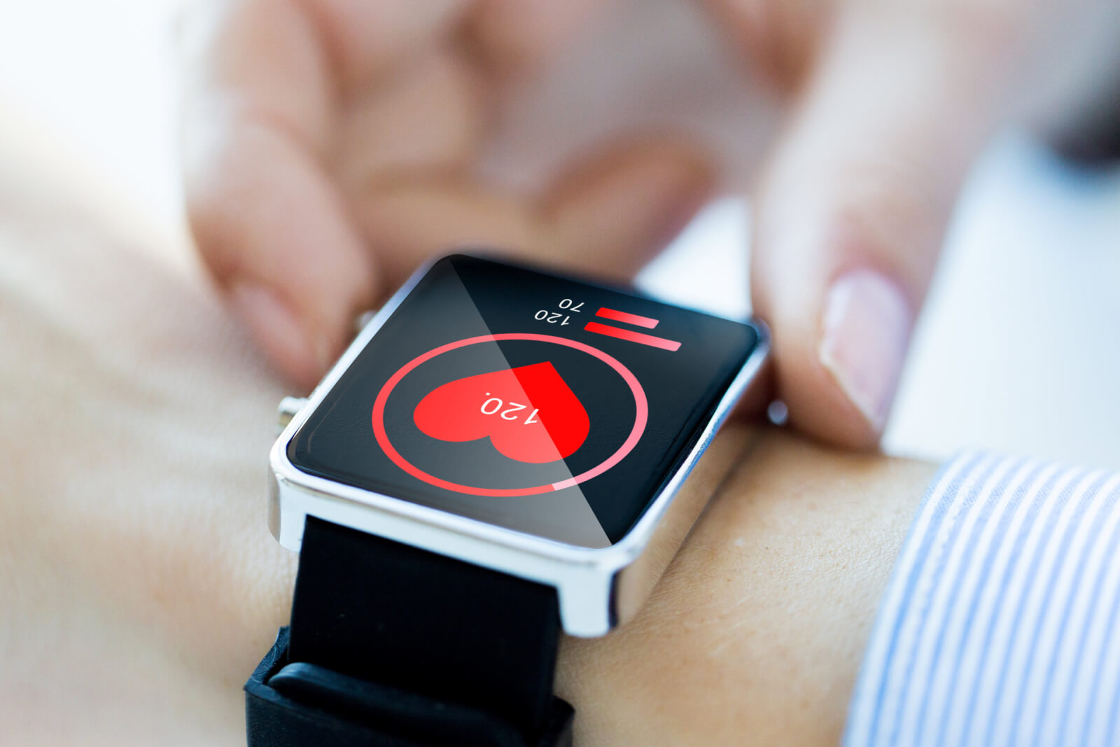
Icons can quickly and effectively communicate functions or content. They should be simple, recognizable, and consistent throughout the app. When designing or choosing icons for a healthcare app, it’s important to stick to widely accepted symbols. For example, a heartbeat icon universally signifies heart rate or cardiovascular health.
Illustrations
These can be used to explain medical procedures, depict anatomy, or provide instructions in a more engaging and comprehensible way. They can break down complex concepts into easily understood visuals. However, it’s crucial to maintain a balance and not overwhelm the app with too many illustrations.
Infographics
These are a combination of images and text and can present data or concepts in a visually compelling way. Infographics can simplify complex medical data, making it easier for users to understand and remember.
Using visual elements effectively is an art that requires a deep understanding of the user and the information being conveyed. When done correctly, it can significantly enhance the app’s branding, user experience, and overall success.
Establishing trust through visual design
In healthcare app design, establishing trust is crucial, as users need to feel confident in the app’s ability to handle sensitive health information and provide accurate, reliable advice. Visual design plays a significant role in conveying trustworthiness, security, and credibility to users.
Importance of conveying trust and reliability through visual design
The visual design of a healthcare app greatly influences users’ perceptions of its trustworthiness and reliability. An app that appears professional, visually appealing, and easy to navigate is more likely to instill confidence in users, encouraging them to entrust the app with their personal health information. In contrast, a poorly designed app can raise doubts about its credibility and discourage users from engaging with it.
Creating a sense of security and privacy through design
Given the sensitive nature of health information, it is essential for healthcare apps to prioritize security and privacy. Visual design can help convey a sense of security and privacy by incorporating elements such as:
Clear and concise privacy policies
Display the app’s privacy policy prominently and ensure that it is easy to understand, so users are aware of how their data will be used and protected.
Trust badges and certifications
Include badges or certifications from reputable organizations to demonstrate that the app follows industry best practices and adheres to relevant regulations.
Secure login and authentication
Implement secure login and authentication methods, such as biometric authentication or two-factor authentication, and communicate these features through the app’s design.
Leveraging visual design to establish credibility and authority
Visual design can also be used to establish credibility and authority in a healthcare app by:
Showcasing expertise
Highlight the qualifications and expertise of the professionals behind the app, such as doctors or medical specialists, to assure users of the app’s reliability and accuracy.
Presenting testimonials and reviews
Showcase positive user testimonials and reviews to build trust and credibility among potential users.
Incorporating a professional and consistent visual identity
A polished and consistent visual identity across all touchpoints, including the app’s interface, website, and marketing materials, demonstrates professionalism and attention to detail, contributing to the app’s credibility.
By focusing on visual design elements that convey trust, security, and credibility, healthcare app developers can foster user confidence and encourage engagement with their app.
Incorporating Emerging Design Trends in Healthcare Apps
Keeping pace with the latest design trends is essential for healthcare apps to stay relevant and competitive. However, it’s important to ensure that any design trend incorporated aligns with the app’s overall branding and enhances the user experience. Let’s discuss some of the emerging design trends and their potential impact on healthcare app branding.
Embracing Minimalism and Simplicity in Design
Minimalistic design is all about simplicity, with a focus on functionality. It revolves around the idea of “less is more” by using only essential elements such as simple shapes, clean lines, ample white space, and a restrained color palette. In healthcare apps, a minimalist design can make interfaces easier to navigate, reduce user cognitive load, and make critical information or actions more noticeable.
Implementing a minimalist design can signify the brand’s commitment to delivering user-friendly and straightforward experiences. However, it’s crucial to ensure that this simplicity doesn’t lead to the exclusion of necessary information or functions that users need.
Leveraging Gamification and Micro-interactions to Enhance Engagement
Gamification involves applying game mechanics into non-game settings to increase user engagement, motivation, and overall enjoyment. In healthcare apps, this could mean incorporating points, badges, leaderboards, challenges, or progress tracking. Gamification can make using the healthcare app more fun and rewarding, encourage positive health behaviors, and increase adherence to treatment plans.
Micro-interactions are small, subtle animations or design elements that guide, inform, or reward the user. Examples include a button changing color when clicked or a progress animation. These can make the interface feel more dynamic and interactive, provide feedback, guide users, or add a touch of delight to the user experience.
Incorporating Immersive Design Elements such as AR and VR
Augmented Reality (AR) and Virtual Reality (VR) are immersive technologies that can provide rich, engaging experiences. In healthcare apps, they can serve various purposes, such as educating patients about their health conditions, visualizing treatment outcomes, facilitating physical therapy through guided exercises, or reducing anxiety through therapeutic VR experiences.
Integrating AR and VR elements can significantly elevate the app’s user experience, making it more engaging, interactive, and beneficial for users. However, it’s important to note that the use of these technologies should be carefully considered based on the nature of the app, the user needs, and the added value they provide.
As with all design trends, it’s crucial to carefully evaluate their relevance and potential impact before incorporating them into the healthcare app. Remember, trends come and go, but the primary goal should always be to enhance the user experience and support the app’s overall branding and objectives.
The role of graphic designers in healthcare app branding
Graphic designers play a vital role in the success of healthcare app branding, as they are responsible for creating visually appealing and user-friendly interfaces that convey trust and professionalism. Working with experienced and specialized graphic designers can greatly enhance the overall design and user experience of a healthcare app.
Importance of working with experienced and specialized graphic designers
Experienced and specialized graphic designers bring a wealth of knowledge and expertise to healthcare app branding projects. They understand the unique challenges and requirements of designing for the healthcare industry, such as ensuring compliance with accessibility standards and conveying complex medical information in an easily digestible format. By working with skilled graphic designers who have a deep understanding of the healthcare sector, app developers can create visually appealing and functional apps that effectively engage users and convey trust.
Collaborating with designers in the design process
Collaboration between app developers and graphic designers is critical for successful healthcare app branding. By involving designers early in the development process, developers can ensure that design considerations are integrated throughout the app’s development and not merely added as an afterthought. Regular communication and feedback between developers and designers can help identify and address any design-related issues, resulting in a more cohesive and polished final product.
Visual design is a crucial aspect of healthcare app branding, as it influences user engagement, adoption, and trust. By prioritizing visual design elements such as color, typography, and visual hierarchy, healthcare app developers can create apps that are not only visually appealing but also user-friendly and accessible. Working closely with experienced graphic designers and fostering a collaborative design process ensures that the final product effectively meets the needs of users and stands out in the competitive healthcare app market.